Most "best marketing dashboard" articles show you ten screenshots and a list of tools. None of them tell you the one thing that decides whether your dashboard survives past week three: the data model behind it and how it stays fed.
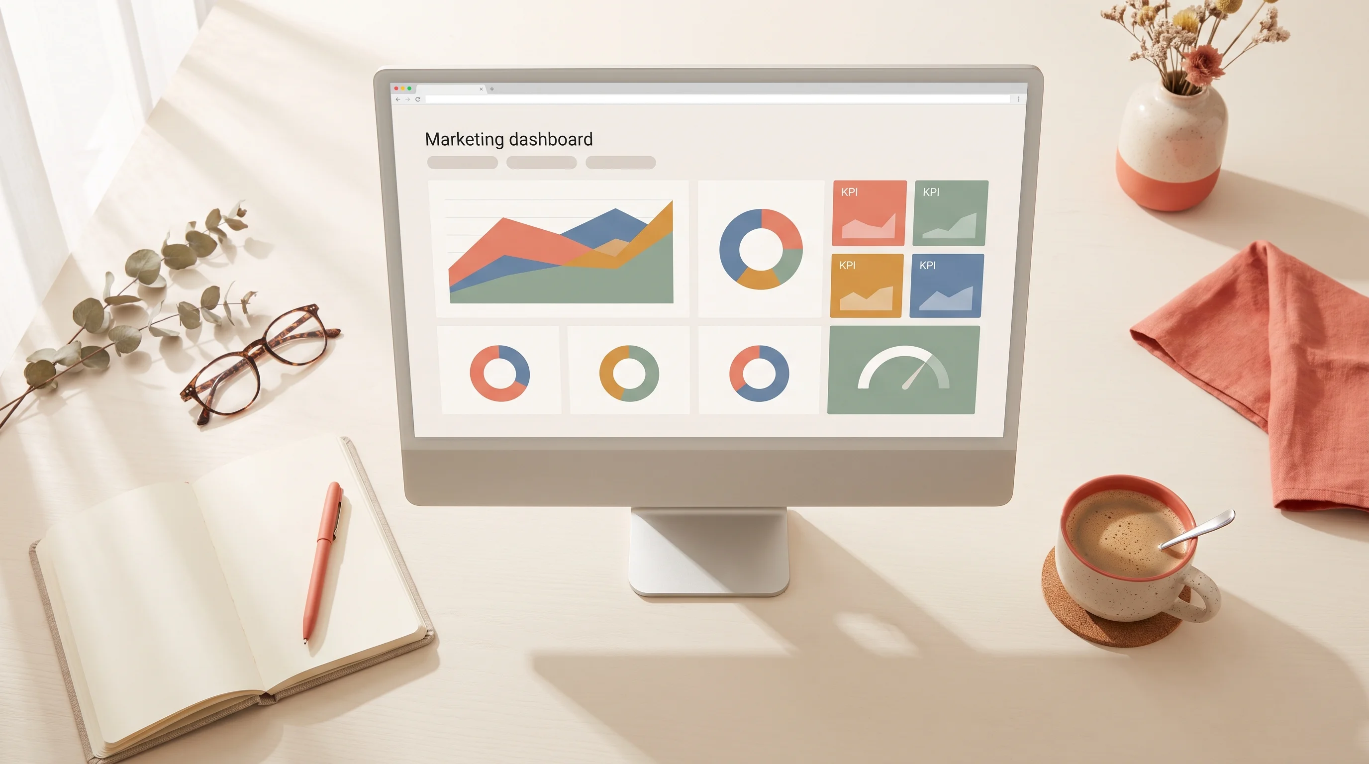
A marketing analytics dashboard is not a design problem. It is a plumbing problem wearing a design costume. The prettiest Looker Studio report in the world is useless the moment the data behind it goes stale, and manual CSV exports guarantee it will.
So this is not another tool roundup. Below are 8 marketing analytics dashboard templates you can steal, each with the metrics that belong on it, the layout that works, and the data sources you need to wire in to keep it current. Build the pipeline first, then the pixels.
The rule every good dashboard follows
Before the templates, one principle that separates a dashboard people check daily from one they forget by Friday: every metric on the main view must map to a decision.
If seeing the number would not change what you do this week, it belongs in a drill-down, not on the front page. Vanity metrics like raw impressions or total followers are the fastest way to train your team to ignore the whole thing.
The other half of the rule: every core metric needs a target. A conversion rate of 2.4% means nothing until you know whether you were aiming for 2% or 4%. A dashboard without target lines is a wall of trivia. This is the same discipline we bring to every build on our analytics and reporting service: metrics tied to decisions, targets on everything, and a pipeline that refreshes on its own.
1. The executive summary (CMO one-pager)
Who reads it: Leadership, weekly. The decision it drives: Where to shift budget next month.
This is the dashboard that goes in the Monday meeting. It answers one question: is marketing turning spend into revenue, and where.
Metrics to include:
- Total spend vs budget (with a target line)
- Marketing-sourced pipeline and revenue
- Blended cost per acquisition
- Return on ad spend, blended across channels
- Month-over-month trend on each of the above
Keep it to a single screen with no scrolling. Big numbers, clear deltas, red or green against target. No channel-level detail here - that lives in template 2.
Data sources: Ad platforms (Google, Meta, LinkedIn), your CRM for pipeline and revenue, and a spend tracker. This is a blended view, so the numbers have to be reconciled across sources, which is exactly where most self-serve builds fall apart.
2. The paid acquisition dashboard
Who reads it: The performance marketing team, daily. The decision it drives: Which campaigns to scale, pause, or fix today.
This is the workhorse. It breaks spend and results down by channel, campaign, and ideally ad set.
Metrics to include:
- Spend, impressions, clicks, and CTR by channel
- Cost per click and cost per lead by campaign
- Conversion rate from click to lead to customer
- Return on ad spend per channel
Layout matters here. Put a channel comparison at the top, then a sortable campaign table below it. The team should be able to spot the worst-performing campaign in five seconds.
3. The SEO and content dashboard
Who reads it: Content and organic teams, weekly. The decision it drives: What to write next and what to refresh.
Organic is a long game, so this dashboard trends over months, not days.
Metrics to include:
- Organic sessions and their trend
- Ranking keywords by position bucket (1-3, 4-10, 11+)
- Top landing pages by traffic and by conversion
- Content that is decaying (traffic dropping quarter over quarter)
The most useful panel here is the decay report. It tells you which existing pages to refresh, which is almost always higher ROI than writing something new. If you are choosing a platform for this view, our breakdown of Looker Studio vs Power BI walks through which handles blended organic data better.
4. The funnel and lifecycle dashboard
Who reads it: Revenue and RevOps, weekly. The decision it drives: Where the funnel is leaking.
This one ignores channels entirely and follows the human: visitor to lead to MQL to SQL to customer.
Metrics to include:
- Volume at each funnel stage
- Conversion rate between each stage
- Average time in each stage
- Drop-off rate, highlighted where it is worst
A funnel dashboard earns its keep by making one bad conversion step impossible to ignore. When lead-to-MQL is healthy but MQL-to-SQL is leaking, you know the problem is qualification, not traffic.
Data sources: Almost entirely your CRM. This is why CRM hygiene matters so much - garbage stage data makes this dashboard lie to you.
5. The social media performance dashboard
Who reads it: Social and brand teams, weekly. The decision it drives: What content format and cadence to double down on.
Metrics to include:
- Engagement rate by platform and by post format
- Follower growth trend (secondary, not headline)
- Reach and saves or shares as intent signals
- Traffic and conversions from social, pulled from analytics
The trap here is stopping at engagement. A social dashboard that never connects to traffic or conversions is a vanity report. Always include the downstream columns so social has to prove it moves the business.
6. The email and lifecycle marketing dashboard
Who reads it: Lifecycle and CRM marketers, weekly. The decision it drives: Which flows and campaigns to fix or expand.
Metrics to include:
- Open, click, and conversion rate by campaign and by automated flow
- List growth and unsubscribe rate
- Revenue per email or per recipient
- Deliverability and bounce rate
Separate one-off campaigns from automated flows on this view. Flows are your compounding asset, and they deserve their own trend line rather than being averaged into blasts.
7. The agency client reporting dashboard
Who reads it: Clients, monthly. Account managers, weekly. The decision it drives: Renewal, and where to focus the retainer.
If you run an agency, this is the marketing analytics dashboard that keeps clients paying. It has to be clean, white-labeled, and self-explanatory, because the client reads it without you in the room.
Metrics to include:
- Results against the goals in the contract
- Spend and cost per result, plainly stated
- The three wins of the period, called out
- A clear next-step or recommendation panel
The build challenge is scale: one template, many clients, each with different data sources. That is a workflow and connector problem more than a design one, and it is worth reading how a repeatable white-label reporting setup turns one dashboard into fifty without manual rework.
8. The real-time campaign war room
Who reads it: The whole team, during a launch. The decision it drives: Live adjustments during a high-stakes campaign.
For product launches, sales events, or big paid pushes, a slow-refreshing dashboard is useless. This one updates in near real time.
Metrics to include:
- Live spend pacing against the campaign budget
- Conversions and revenue as they land
- Cost per result, updating through the day
- Anomaly flags when a metric spikes or crashes
This is where 2026 dashboards have genuinely moved forward. Anomaly detection now flags a conversion-rate collapse or a runaway ad spend automatically, often with a likely cause attached, instead of waiting for someone to notice.
The part every template shares: the pipeline
Notice what all 8 templates have in common. The layout differs, the metrics differ, but every single one lives or dies on the same thing: fresh, reconciled data arriving on a schedule without a human exporting anything.
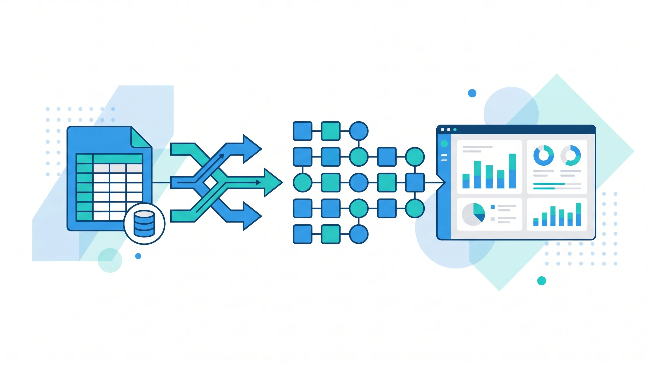
That is the work most tool roundups skip. Connecting Google Analytics, your ad platforms, and your CRM into one clean model, deduping across sources, and refreshing it automatically is the actual project. The dashboard is the easy last mile.
The cleanest way to keep dashboards fed is to treat the data flow as its own automated system. Piping sources in on a schedule is a workflow automation job, and getting that layer right is what separates a dashboard that lasts a year from one that breaks the first time someone goes on vacation. If you want the deeper build philosophy, our guide on data analytics consulting covers what you should actually own when the reporting is done.
Steal these, then make them yours
Start with one template that maps to a real weekly decision. Wire in the data properly so it refreshes on its own. Put a target on every core metric. Then, and only then, worry about how it looks.
Do that, and you will have a marketing analytics dashboard people actually open - not a beautiful report that quietly goes stale by month two.
Ready to build reporting that stays current and answers real questions? See how we build analytics and dashboard systems that your team owns end to end.