
Every KPI dashboard guide tells you to start by picking a template. Browse the gallery, find the layout that matches your department, copy it, done. That advice is backwards, and it is the reason so many dashboards get built once and abandoned by month two.
The layout was never your problem. You can sketch a good sales dashboard on a napkin in five minutes. What actually decides whether a dashboard survives is the thing no gallery shows you: where each number comes from, whether it updates itself, and whether anyone changes a decision when it moves.
So this guide does both halves. Below are seven KPI dashboard examples by function, each with the metrics that belong on it and, more importantly, the decision each one is supposed to trigger. Then the part the galleries skip: why most of these dashboards quietly die, and what makes the difference.
What a KPI dashboard is actually for
A KPI dashboard consolidates your key performance indicators onto one screen, pulling from the systems where the data lives and rendering it as charts and numbers. Tableau describes it as a tool that lets you monitor, analyze, and visualize key metrics in one place so you can act quickly. Qlik frames the same idea around four core dashboard types tied to how different roles consume data.
Hold onto one test as you read the examples. A metric earns its spot on a KPI dashboard only if a specific person changes a specific decision when that number moves. Everything else is a vanity metric wearing a nice chart.
The 7 KPI dashboard examples
Each example below lists the metrics that belong on it and the decision it is built to drive. Treat them as starting points, not gospel. Your business will add or cut two or three.
1. Executive dashboard
The company-wide view for founders and leadership. Its job is not depth, it is early warning across the whole business.
- Metrics: revenue vs target, gross margin, cash runway, new customers, churn rate, pipeline value.
- Decision it triggers: where to point attention this week. If runway tightens or churn ticks up, the executive dashboard is what surfaces it before it becomes a quarterly surprise.
Keep this one ruthless. Five to seven numbers. If leadership needs to drill deeper, they open the function-specific dashboard below.
2. Sales KPI dashboard
The most requested dashboard in almost every business, and the one most often cluttered.
- Metrics: pipeline value by stage, win rate, average deal size, sales cycle length, activities per rep, quota attainment.
- Decision it triggers: which deals to push and which reps need coaching. A stalled stage or a falling win rate tells a sales manager exactly where to spend Monday.
3. Marketing KPI dashboard
Where vanity metrics breed fastest. Impressions and follower counts feel good and change nothing.
- Metrics: cost per lead, lead-to-customer conversion rate, marketing qualified leads, cost per acquisition, return on ad spend, pipeline sourced by marketing.
- Decision it triggers: where to move the next dollar of budget. If one channel's cost per acquisition doubles, spend shifts. We go deeper on this in our marketing analytics dashboard templates.
4. Financial KPI dashboard
The one finance actually trusts, because the data usually comes straight from the accounting system.
- Metrics: revenue, gross and net margin, operating cash flow, accounts receivable days, burn rate, budget vs actual.
- Decision it triggers: spending and hiring pace. When receivable days stretch or burn accelerates, the finance dashboard is what says slow down.
5. Customer support dashboard
The dashboard that protects revenue you already earned.
- Metrics: first response time, average resolution time, ticket backlog, customer satisfaction score, ticket volume by category.
- Decision it triggers: staffing and product fixes. A spike in one ticket category is a product bug report in disguise, and a rising backlog is a staffing signal.
6. Operations dashboard
The daily driver for teams that run a repeatable process, from fulfillment to a service delivery pipeline.
- Metrics: throughput, on-time completion rate, error or defect rate, cost per unit, capacity utilization, cycle time.
- Decision it triggers: where the bottleneck is today. Operations dashboards are checked hourly, not monthly, so they need live data more than any other example on this list.
7. SaaS / product dashboard
For anyone running a subscription product, where the health of the business hides in usage, not just revenue.
- Metrics: monthly recurring revenue, activation rate, daily and monthly active users, feature adoption, net revenue retention, churn.
- Decision it triggers: what the product team builds next and where onboarding leaks. A low activation rate points straight at the first-run experience.
The part every gallery skips
Here is what none of those tidy KPI dashboard examples tell you: the layout is maybe 20 percent of the work. The other 80 percent is the plumbing, and that is exactly where dashboards go to die. Three failure modes account for almost all of it.
Failure 1: the data is stale or manual
The single most common reason a KPI dashboard stops getting used is that someone has to update it by hand. A person exports a CSV from the CRM, pastes it into a sheet, fixes the formulas, and refreshes the chart. That works for exactly three weeks. Then that person gets busy, the numbers go stale, one wrong figure gets spotted, and the whole team quietly stops trusting the dashboard. They go back to asking around in chat.
A dashboard is only as alive as its slowest data feed. If any number on it depends on a human remembering to update it, that number will be wrong when it matters most.
Failure 2: vanity metrics crowd out decisions
The second failure is putting metrics on the dashboard because they are easy to pull, not because they drive a decision. Impressions, raw pageviews, total signups, follower count. They trend up and to the right, they feel like progress, and no one ever does anything differently because of them.
Run every metric through the same test: name the person who acts on it and the decision they make. If you cannot, cut it. A five-metric dashboard that changes behavior beats a twenty-metric dashboard that gets admired and ignored.
Failure 3: nobody owns it
The third failure is orphaning. A dashboard gets built during a project, everyone loves it, and then no one owns keeping it correct as the underlying systems change. A field gets renamed in the CRM, a feed breaks silently, and three months later the dashboard is confidently displaying nonsense. Someone has to own the pipeline, not just the picture.
What actually makes a dashboard survive
The dashboards that outlive their launch week share one trait: the data flows into them automatically. No copy-paste, no weekly refresh ritual, no single person as the human integration layer.
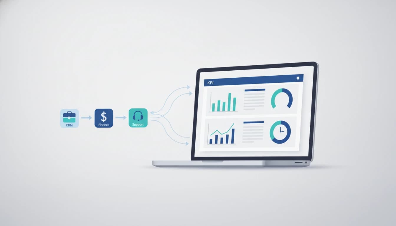
That means wiring your source systems directly to the dashboard. The CRM feeds sales and marketing metrics. The accounting platform feeds finance. The support tool feeds tickets. The product database feeds usage. When one of those connections breaks, someone gets alerted, not the whole team getting quietly misled.
This is where building a dashboard stops being a design task and becomes a data-integration task. It is the work behind our analytics service: connecting the systems where your numbers actually live so the dashboard updates itself, and choosing the handful of metrics per role that genuinely move a decision. The plumbing that keeps those feeds flowing is a form of workflow automation - the same pipe-building discipline, pointed at reporting instead of operations.
If you are still choosing where the dashboard will live, our roundups of the best business intelligence tools and data visualization tools compare the platforms, and our guide to building a data dashboard your team actually opens covers the design half in more depth.
A quick note on cost
You do not need an expensive platform to start. Google's Looker Studio is free and connects to a wide range of sources, which is enough for most first dashboards. Paid platforms like Power BI start low per user (see the Power BI pricing page for current tiers) and earn their cost when you need governed, company-wide reporting.
As an illustration, a team that spends two hours a week manually updating a spreadsheet dashboard is burning roughly 100 hours a year on a task a live connection does for free. That is the real cost of the manual version, and it is the line no template gallery puts on the page.
Key takeaways
- The template is the easy 20 percent. Every KPI dashboard example you can copy is fine as a starting layout. The layout is not why dashboards fail.
- Build one dashboard per role. An executive view, a sales view, a finance view. One giant shared dashboard serves no one well.
- Every metric must trigger a decision. Name the person and the action, or cut the metric. Vanity numbers get admired and ignored.
- Automate the data feed or the dashboard dies. Manual updates have a three-week shelf life. Wire the source systems directly and alert on breakage.
- Assign an owner. Someone has to keep the pipeline correct as systems change, not just the picture pretty.
Pick the example that matches your team, cut it down to the metrics that change a decision, and then spend your real effort on the feed. If you want that feed built so the dashboard updates itself, that is exactly what our analytics team does.